
Mastering Color Theory in Fashion Photography
What is Color Theory
Color theory is a fundamental concept used in visual arts that explains how colors interact with each other and how they can be combined to create desired effects. It's a massive part of the art world, and its principles are often used by artists, designers, and photographers to evoke specific reactions or to set the mood in their work.
Understanding color theory involves knowledge of the color wheel, primary colors, secondary colors, and tertiary colors. The color wheel is a circular diagram of colors arranged by their chromatic relationship. Primary colors are the base colors from which all other colors are made, and they include red, blue, and yellow. When you mix primary colors, you get secondary colors, which are green, orange, and purple. Tertiary colors are created by mixing primary and secondary colors.
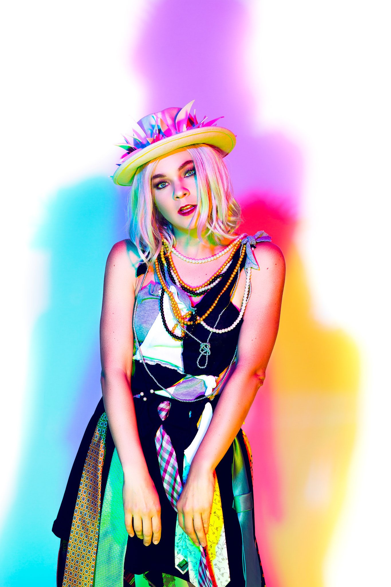
In the context of fashion photography, color theory is used to create a visual narrative. The colors in a photograph can evoke certain emotions, create a certain mood, and even guide the viewer's eye. For example, a fashion photographer might use a complementary color scheme to create a vibrant and energetic feel, or an analogous color scheme to create a harmonious and calming feel.
Understanding the Color Wheel
The color wheel is a crucial tool in color theory. It's a circular diagram that represents the relationships between different colors. The color wheel is divided into three categories: primary colors (red, blue, and yellow), secondary colors (green, orange, and violet), and tertiary colors (red-orange, yellow-orange, yellow-green, blue-green, blue-violet, and red-violet).

Understanding the color wheel is essential for photographers as it helps them make decisions about color harmony in their images. It can guide the photographer in choosing a complementary color scheme, where colors opposite each other on the wheel are used, or an analogous color scheme, where colors next to each other on the wheel are used.
In fashion photography, the color wheel can be used to plan the colors of the clothes, the background, and even the lighting. For example, if the clothes are blue (a primary color), the photographer might choose to use orange (a secondary color created by mixing the other two primary colors, red and yellow) for the background to create a complementary color scheme.
Understanding Color Harmonies
Color harmonies, also known as color schemes, are combinations of colors that are considered pleasing to the eye. These include:
Complementary Colors: These are colors that are directly opposite each other on the color wheel, such as red and green or blue and orange. These colors create high contrast and can make your images pop.
Analogous Colors: These are colors that are next to each other on the color wheel, like red, orange, and yellow. These colors create a harmonious blend and are often found in nature.
Triadic Colors: These are three colors that are evenly spaced around the color wheel. This scheme can create a balanced and vibrant feel.
Monochromatic Colors: This scheme involves the use of one color in varying shades and tints. It can create a minimalist and cohesive feel.
In fashion photography, color harmonies can be used to create visually striking images. For example, a complementary color scheme can create a vibrant and energetic feel, while an analogous color scheme can create a harmonious and calming feel. A triadic color scheme can create a balanced and vibrant feel, while a monochromatic color scheme can create a minimalist and cohesive feel.

Understanding Photography Color Theory
Photography color theory involves the application of color theory principles to photography. It's about understanding how colors can impact the mood, feel, and story of a photograph. It's about knowing how to use color
to guide the viewer's eye and highlight the subject of the photograph.
In fashion photography, color theory can be used to create striking images that evoke specific emotions. For example, using complementary colors can create a vibrant and energetic feel, while using analogous colors can create a harmonious and calming feel. A triadic color scheme can create a balanced and vibrant feel, while a monochromatic color scheme can create a minimalist and cohesive feel.
Photographers can also use color theory to guide their choice of clothing, props, and backgrounds. For example, if the subject is wearing a red dress, the photographer might choose a green background to create a complementary color scheme. Alternatively, if the subject is wearing a blue suit, the photographer might choose a yellow background to create a contrasting color scheme.
Understanding Color & Light
Color and light are intrinsically linked. The colors we see are the result of light being reflected off objects and into our eyes. Different light sources can dramatically change the colors in a photograph. For example, sunlight during the golden hour can cast a warm, golden hue, while overcast conditions can result in more muted, cooler colors.
Understanding how different light sources affect colors can help photographers plan their shoots and achieve the desired mood in their images. For example, shooting during the golden hour can help achieve a warm, romantic mood, while shooting under fluorescent lights can create a cool, clinical feel.
In fashion photography, understanding the relationship between color and light is crucial. The lighting can dramatically affect the colors of the clothes, the model's skin, and the overall mood of the photograph. By carefully controlling the lighting, photographers can enhance the colors in their images and create a specific mood or atmosphere.
Color Science: How Your Eyes Perceive Light
The human eye perceives color through a process called additive color. This process involves the combination of different wavelengths of light to produce different colors. The primary colors of light are red, green, and blue, and all other colors can be made by combining these three. This is different from the primary colors in traditional color theory (red, blue, and yellow), which are based on subtractive color - the colors that are seen when white light is reflected off a surface.

When light hits an object, the object absorbs some wavelengths of light and reflects others. The wavelengths that are reflected are what we perceive as the color of the object. For example, an object appears red because it absorbs all colors of light except for red, which it reflects.
Understanding how the human eye perceives color can help photographers make more informed decisions about lighting, color balance, and post-processing. For example, they might choose to use a specific light source to enhance certain colors, or they might adjust the color balance in post-processing to achieve the desired effect.
Color Theory in Shooting vs. Photo Editing
Color theory is not only important during the shooting process but also during photo editing. In the shooting process, the photographer can use color theory to choose their subjects, backgrounds, and lighting to create a desired color scheme. They can use complementary colors to create contrast, analogous colors to create harmony, or monochromatic colors for a minimalist look.
In photo editing, the photographer can further enhance or alter the colors in their images. They can adjust the hue, saturation, and luminance of different colors to achieve the desired effect. They can also use color grading to create a specific mood or aesthetic in their images.
Using Color Theory in Your Fashion Shoot
Plan Your Color Palette
Before embarking on a photo shoot, it is important to plan out your color palette to achieve the best results. This involves selecting the colors of the clothes, the background, and any props used in the shoot. One effective way of making informed decisions about your color palette is by using the color wheel to guide your choices. The color wheel is a tool used to visually represent the relationships between colors. It is a circular diagram that shows the primary, secondary, and tertiary colors. With the help of the color wheel, you can decide on a complementary color scheme or a triadic color scheme. A complementary color scheme uses colors opposite each other on the color wheel, while a triadic color scheme involves the use of three colors that are equidistant from each other on the color wheel. You can also choose to use analogous colors, which are colors next to each other on the color wheel and create a harmonious effect. Planning your color palette ensures that your photos will have a cohesive and professional look. A well-designed color scheme can enhance the mood of the photos and make them more appealing to viewers. It also helps to communicate your intended message effectively. Therefore, before you start your photo shoot, take some time to plan out your color palette using the color wheel to create stunning results.
Consider the Lighting

The colors in your images can be dramatically affected by the lighting you use. Whether you're taking photos indoors or outdoors, different light sources can cast different hues on your subject. This is why it's important to consider the time of day and the type of light you'll be shooting in, as it can greatly impact the final result of your images. For example, shooting during the golden hour, which is the hour after sunrise or before sunset, can create a warm and glowing effect on your subject. On the other hand, shooting in harsh midday sunlight can cause shadows and overexposure, resulting in a flat and washed-out image. Similarly, using artificial light sources like fluorescent or incandescent bulbs can also affect the colors in your photos. Fluorescent bulbs can give off a cool and blue hue, while incandescent bulbs can create a warm and orangey effect. Before taking photos, it's important to inspect the lighting conditions and make adjustments to ensure that you're getting the colors you want. This could mean adjusting the white balance on your camera, using a different type of light source, or simply finding a better time of day to shoot. By paying attention to the lighting, you can enhance the colors in your images and create stunning visual effects.
Use Color to Guide the Eye
Color is a powerful tool in photography that can guide the viewer's eye and highlight the subject of your photograph. By using different colors strategically, you can control where the viewer looks and what they focus on in your image. One way to achieve this is by using contrasting colors. For example, a subject with a bright red shirt against a green background will immediately catch the eye of the viewer. Similarly, muted colors can create a more calming effect and draw attention to the subject in a more subtle way. Another way to use color is to create a focal point. By making the subject the only item in a photograph that is in color, it can stand out from the rest of the image and draw the viewer's attention. This technique can emphasize the importance of the subject and add impact to the overall photo. It is important to remember that the colors in your photo should also complement each other. Harmonious colors, such as those found in a sunset or garden, can create a pleasing and relaxing image. While contrasting colors can create sharp, dramatic images, it is important to use them sparingly and with intention to avoid overwhelming the viewer. By using color effectively in your photographs, you can guide the viewer's eye, highlight the subject, and create an impactful image.
Experiment with Post-Processing
Experimenting with color in post-processing can be a great way to enhance your images and make them even more expressive. By adjusting the hue, saturation, and luminance of different colors, you can not only correct any color imbalances present in the original photograph but also create a completely different mood or atmosphere. For example, by making blues more vibrant, you can emphasize a bright and cheery mood while reducing reds can make a photo seem calmer and more subdued. You can also use color to bring attention to different elements within your photo. A good example would be if you want to make a flower stand out in a sea of greenery; you can add more saturation to the flower's colors and reduce it in the surrounding greenery. This way, the bright hues of the flower will attract the viewer's eye, making it the focus of the shot. Alternatively, if you want to create a more monochromatic effect, you can adjust all colors to maintain a similar saturation level, creating a more cohesive and unified feel. Overall, experimenting with colors in post-processing is an excellent way of giving your images a unique perspective, making them stand out and express the emotions and moods you want to convey.
Study Color Psychology
Colors can be powerful tools to evoke human emotions and stimulate various psychological responses. Our brains process color information at a deep, instinctual level, and certain hues can trigger entirely different emotional reactions. By understanding the principles of color psychology, you can harness the power of color to create compelling and meaningful visuals that resonate with your audience. For example, red is often associated with passion, excitement, and intensity, while blue is linked to calmness, trust, and dependability. Green is known to represent growth, harmony, and nature, while black and white are classic symbols of elegance, sophistication, and purity, respectively. Dentists, for example, often use the color blue in their offices, as it promotes a sense of calm and comfort in individual who may experience dental anxiety. This is why it's essential to study color psychology and learn how different hues can influence human emotions and behavior. Whether you're designing a website, creating a logo or selecting paint colors for a room, choosing the right color palette can make all the difference in making a lasting impression on your audience.
Conclusion
In conclusion, color theory plays a crucial role in fashion photography and understanding its principles can greatly improve the visual impact of your images. The use of complementary colors, for instance, can create a striking contrast that captures the viewer's attention and adds depth to the composition. Similarly, the careful selection of a color palette can evoke mood and emotion, conveying a message that goes beyond the surface level of the subject matter. Additionally, understanding the psychology of colors can help you choose colors that resonate with your target audience and create a connection with them. For example, warm colors such as red and yellow can evoke a sense of excitement and passion, while cool colors such as blue and green can evoke a sense of calm and tranquility. Ultimately, the mastery of color theory in fashion photography can elevate your work to a higher level of sophistication, creating images that are not only aesthetically pleasing but also communicate a powerful message. Therefore, it is important to invest time and effort in studying color theory and experimenting with different color combinations, textures, and lighting techniques. With a deeper understanding of color theory, you can bring a new level of creativity and meaning to your photography, making it stand out in a crowded field.
FAQ Section:
Q1: What is color theory in fashion photography? A: Color theory in fashion photography is the application of color theory principles to create visually striking images. It involves understanding how colors interact with each other, how they can be combined to create desired effects, and how they can evoke certain emotions or set a mood in a photograph.
Q2: How is the color wheel used in fashion photography? A: The color wheel is a crucial tool in fashion photography. It's a circular diagram that represents the relationships between different colors. Photographers use it to guide their decisions about color harmony in their images and to plan the colors of the clothes, the background, and even the lighting.
Q3: What are color harmonies and how are they used in fashion photography? A: Color harmonies, also known as color schemes, are combinations of colors that are considered pleasing to the eye. In fashion photography, color harmonies can be used to create visually striking images. For example, a complementary color scheme can create a vibrant and energetic feel, while an analogous color scheme can create a harmonious and calming feel.
Q4: How does understanding color and light enhance fashion photography? A: Understanding how different light sources affect colors can help photographers plan their shoots and achieve the desired mood in their images. The lighting can dramatically affect the colors of the clothes, the model's skin, and the overall mood of the photograph.
Q5: How is color theory applied in shooting vs. photo editing in fashion photography? A: In the shooting process, the photographer can use color theory to choose their subjects, backgrounds, and lighting to create a desired color scheme. In photo editing, the photographer can further enhance or alter the colors in their images. They can adjust the hue, saturation, and luminance of different colors to achieve the desired effect.
Q6: How can color theory be used in planning a fashion shoot? A: Before the shoot, the photographer can plan the color palette, which includes the colors of the clothes, the background, and any props. They can use the color wheel to help choose a color scheme. They can also consider the lighting, as different light sources can cast different hues. They can use color to guide the viewer's eye and highlight the subject of the photograph.
Q7: How can color theory be used in post-processing in fashion photography? A: In post-processing, the photographer can adjust the hue, saturation, and luminance of different colors to enhance or alter the mood of their images. They can also use color grading to create a specific aesthetic. This allows them to further enhance the visual impact of their images.
Q8: How can studying color psychology enhance fashion photography?A: Different colors can evoke different emotions, so studying color psychology can help photographers understand how their color choices might affect the viewer's emotional response. This can help them create images that are not only visually appealing but also emotionally resonant.